Who?
It was created by a mysterious, deep thinker, known only as @martinklepsch.
Some say he appears on high-value stamps in Germany and that he once knocked a horse unconscious with a single punch. Others say he loves recursion so much that, in his wallet, he carries a photograph of his wallet.
All we know for sure is that he wields pixels like Bruce Lee wielded nunchucks.
Genesis Theories
Great, unexplained works encourage fan theories, and the re-frame logo is no exception.
One noisy group insist that @martinklepsch's design is assertively
putting the 'f' back into infinity, in a sicking-it-to-the-man kinda way.
They have t-shirts, f u ∞, and angry certainty.
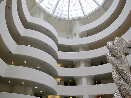
Another group speculates that he created the logo as a bifarious rainbow homage to Frank Lloyd Wright's architectural masterpiece, the Guggenheim Museum. Which is surely a classic case of premature abstraction and over-engineering. Their theory, not the Guggenheim. They sometimes indent by 5 spaces - because "art" - and need ultrawide monitors for yaml.

Then there's the infamous "Bad Touch" faction. So embarrassing. For them, the logo shows the ClojureScript logo mating noisily with re-frame's official architecture diagram. Colour-wise, I guess. Their parties are completely awesome, but you might need someone to bail you out of jail later.

For the Functional Fundamentalists, an earnest bunch with post-Maharishi-Beatles hair, the logo is a flowing poststructuralist rebuttal of OO's vowel duplication and horizontal adjacency. Their alternative abbreviation, FF, is fine, apparently, because "hey, come on man, everyone loves a fricative".
For his part, @martinklepsch has never confirmed any theory, teasing us instead with coded clues like "Will you please stop emailing me" and "Why did you say I hit a horse?".